If you’re using SmallWorlds graffiti boards, you are probably very familiar with the standard use of its color selection palette. Some of SmallWorlds’ most beautiful art has been created using its 216 stock colors, but there’s more to this tool than initially meets the eye.
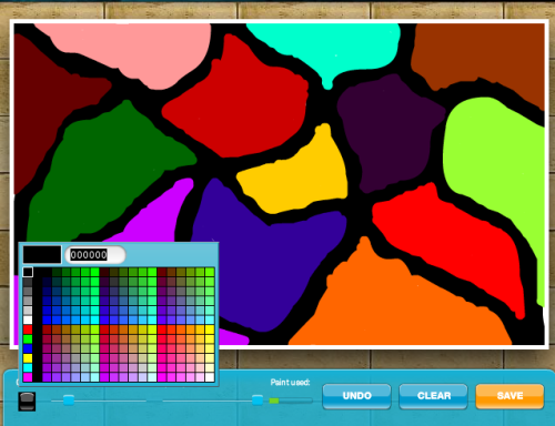
Dragging the mouse along to select a color, you will almost certainly have noticed the flicker of text next to the small “currently selected color” box in the upper-left corner of the palette. For those focused on creating SmallWorlds’ next masterpiece, it would be easy to overlook the potential in this cryptic, flashing box. That, however, would be a mistake.
That text box is your key to the use of literally millions of colors – once you know how to use it.
Hexadecimal.
Colors not shown in the pallet grid have to be typed into the text box using hexadecimal notation. That may sound a bit scary, but you’ll soon find out that it’s really pretty easy. To get a grasp of the concept, try this experiment:
Click your graffiti board’s color selector to open the color pallet. Select the text in the upper-left corner and type 222222 – that’s six “2” characters. Be careful not to move your mouse over any of the color squares in the pallet, or what you type will be replaced by the code for the color your mouse is over.
When you’ve finished typing 222222 in the box, press your Enter key to set that color in the pen. You’ll now be able to draw a shade of grey that’s slightly darker than the darkest grey available in the color palette.
To understand how this happens, take a look at the various shades of grey along the left column in the color palette. Notice that black, the darkest of them all, is represented by 000000. What those zeros are saying is “no light” – Completely dark – Black. As you move the mouse down the column to the darkest grey, 333333, then to the next shade of grey, 666666, you may begin to realize what’s happening – the higher the number, the lighter the shade.
Mousing over the lighter shades of grey, you’ll see that the codes for some of the lighter shades include letters. These letters actually stand for numbers in the hexadecimal system of numbering.
Hex-a-What-i-mal?
There’s that word again. It sounds confusing, but is really pretty easy to use once you get the hang of it. Hexadecimal numbering is, for reasons beyond the scope of this blog, the most efficient way to represent color codes as they’re stored in a computer. That being said, we’ll focus on how to use these hexadecimal codes, or “hex codes”, to get exactly the color you want.
First, the hexadecimal digits are:
0, 1, 2, 3, 4, 5, 6, 7, 8, 9, A, B, C, D, E, and F.
You don’t necessarily need to think of them as numbers – just remember that 0 is the lowest – no color at all – and that F is the highest, the full amount possible for a color. That’s why the hex code for black is 000000 – “no color at all” leaves us with total absence of color. The hex code for white is FFFFFF because the full amount of all colors combined is white.
The second thing you need to understand is that the six digits in a hex code represent three colors: Red, Green, and Blue, and in that order. The first two digits in the hex code represent red, the middle two represent green, and the last two represent blue. Therefore:
- FF0000 is the hex code for the brightest red. It has FF red – the full possible amount – and 00 green and blue, meaning none of those colors.
- 00FF00 is the brightest green, having FF green and 00 (none) of red and blue.
- 0000FF is the brightest blue. It has absolutely no red and green, but the FF (Fullest) amount of blue.
Lastly, think of each color’s pair of hexadecimal characters as separated into two parts representing a Big amount and a Little amount.
Big
RedLittle
RedBig
GreenLittle
GreenBig
BlueLittle
Blue
You can make a red color such as 660000 noticeably brighter by changing it to 760000, but very few (if any) of us can distinguish the difference between 660000 and 670000. The second digit, which controls the “Little Red”, barely makes a difference at all.
To further demonstrate this, go back to your graffiti board’s color palette and compare 00F000 to 000F00. You’ll see that 00F000 is barely distinguishable from the bright green of 00FF00, but 000F00 is almost black – it’s “Lttle green” is full, but that doesn’t count much since the “Big Green” is set to zero.
What the Hex it Good For?
Having more than 16,777,000 colors at your disposal is, indisputably, very cool, but… who really needs all that? There are plenty of colors available in the palette’s squares, right? Well, yes – for most people in most situations, that’s true. However, there are definitely cases where extreme color control is necessary.
Smoothly transitioning from one color to another is only possible by painstakingly increasing (or decreasing) a color from one shade to another by typing the tiniest changes into the text box. Follow the grassy path around the pond, below, with your eye. Nowhere along the way is one shade of green distinguishable from another, but the transition is clear in the upper-left corner.
This was done by placing green dots, one after another from the top-left, downward, and then up and around the pond. For each dot, I increased the fourth of the six digits – the “Little Green” value – by one.
With the color 006600 I made the first dot in the top-left corner of the canvas, then changed to 006700 for the second dot, then 006800, 006900, increasing one for a brighter shade of green each dot. After 006900 came 006A00 – that’s “little green” increasing through the hexadecimal digits, 0, 1, 2, 3, 4, 5, 6, 7, 8, 9, A, B, C, D, E, and F.
After 006F00, I increased the “Big Green” from 6 to 7 and set “Little Green” back to zero – 007000 is one step brighter-green than 006F00.
There are a lot of steps on the path around the pond, but I increased the green value by one “Little Green” for each on, and I really questioned whether it was changing at all until I finally met the start of the path at the top again.
This silly example demonstrates a powerful conceptual tool you can use when painting. Shifting smoothly from one shade to another can provide a really natural feel to backgrounds, and give a very natural and authentic look to many elements in a picture.
Proceed Without Caution
The quickest way to teach yourself these concepts is to just start using them. Give yourself an hour and start typing codes into the color palette’s text box. Remember to always use 6 hex digits – that is, 0-9 and A-F.
It’s a good idea to click a color from the squares on the color palette – any color you like – and then experiment by modifying that color little by little. Don’t be afraid to experiment! Replace the little red, blue, and/or green values, hit enter to set the pen to that color, then draw lines on the canvas side by side to create a smooth transition of color.
If you want some color-code guidance, try this hex code chart:
The fourth column shows the hex code for the color displayed in the second column. Find a color you like from that list, then copy that hex code and paste into the graffiti board color palette’s text box.
Note that hex codes are often prefixed with a #pound-sign. That’s not used in the color pallet, so be sure you do not copy the # sign that prefixes the hex codes on that page.
In Summary
Remember the hexadecimal digits: 0-9 and A-F; remember that the red, green, and blue color components are the first, second, and third pair of digits in the hex code; remember that the first of each pair gives you the Big change and the second gives you the Little change.
By practice and by understanding these concepts, you’ll take one more step toward using the graffiti board to its fullest potential.
Enjoy!


